How to structure your navigation menu for SEO

Haley Carroll
| Published on
September 29, 2023
If you have a brick and mortar place of business, you do everything you can to make sure your customers are able to get around your space easily. You have a sign outside the building, use directional instructions when needed, and make sure the layout is conducive to their experience.
Your website is an extension of your physical location, or it’s potentially your entire public space if you’re an online business.
Though it may only exist on our screens, your website needs to follow the same main rule as your “real world” spaces: make it easy for your customers to get around.
This discipline is called website navigation. It refers to how users are able to move about the different pages on your website.
This is mostly determined by your navigation menus. How you structure the menus on your site will determine if users find exactly what they’re looking for in a just a few clicks, or if they close your site in frustration.
Why is website navigation important?
User experience
User experience (UX) refers to every possible way that someone is able to interact with a company, its products, and services.
In recent times, much of the buzz around UX design has been focused on optimizing a user’s online experience of a company, which includes how they interact with a company’s website, of course.
Whenever you’re making changes to your site, you need to consider how they will affect your target users when they are first discovering your site, coming back to learn more information, or making steps toward converting.
Everything you do should make it easier for users to move down the funnel. This includes decreasing the number of clicks they need to make to get somewhere, making the most relevant pages more easily accessible, and reducing the amount of time they need to spend searching/clicking back and forth to find a specific page.
Helping out the crawlers
Google is incredibly smart, but it is not omniscient. It won’t automatically know what every page on your website is for. Instead, its bots have to “crawl” your site for information.
These bots will get around your site like everyone else does; using links on pages to travel from one page to the next. As they do, they pick up data points to accurately index your page and site.
Internal links help bots find pages on your site, and it gives them context by indicating that two linked pages are related. Having links to your webpage also helps to build its authority in Google’s eyes.
That makes the internal linking structure of your website very important for ranking on the Search Engine Results Page.
If your website has a poor internal linking structure, Google bots won’t be able to interpret your site’s contents and it will result in a lower ranking or missing out on being indexed for some of your target keywords.
Best internal linking structures for UX and SEO
So what should your website architecture look like? In most cases, you’ll want to aim for one of the two structures below.
Horizontal (flat) linking structure
This architecture minimizes the number of clicks a user needs to make to get anywhere on the site.
By utilizing one, two, or more levels of category pages, users can easily find specific pages by navigating to the appropriate categories. By adding many subcategories under the broader category pages, users are able to get specific quickly. When on any given page, users are never too far from the homepage, either.
This structure is the opposite of a deep linking structure, which will place pages far away from the homepage and make them possible to reach only through a long and arduous linking path.
The graphic below shows this methodical, organized approach in action:

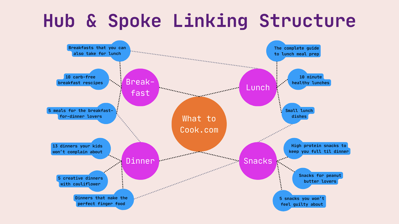
Hub-and-spoke linking structure
This internal linking structure follows a similar philosophy to the flat linking structure; it minimizes the number of clicks a user needs to make. However, if your webpages are a bit harder to categorize and require more interconnectivity, this could be the structure for you.
From the home page, topic pages are used as central hubs to link to specific content. Pages may be linked to more than one hub in the case they’re relevant to multiple topics.
This allows users to easily find content related to a certain subject and also discover content that is related or similar.
Let’s look at a visual example of this linking structure:
Types of website navigation menus
Now that you’ve created a solid internal linking structure, it's time to create a menu so your users can navigate through this structure.
When you think of website navigation menus, your mind probably jumps to the horizontal bar that spans across the top of most homepages. However, that is only one menu type that you may include on your site.
Top menu / universal navigation
Starting with the most popular type of menu, the horizontal navigation bar. This menu is placed at the top of your website’s homepage, and it’s typically the first menu your users will see.
These menus display a number of items across the bar that users can click to, but it’s important not to crowd too many items on here-that will be overwhelming for people to look at.
Instead, break your site down into a few major categories, and think about what your users want to see the most.
If you’re an e-commerce site, what are your major product categories? Do users care about new arrivals? How about clearance, or last-chance items? Do users want to easily learn about your brand story?
If you provide services, users will want more information on the types of services you provide, case studies/success stories, pricing, and more about you and your qualifications.
These categories will look a little different for every business. Try not to overthink it; just pick out the major aspects/categories that the bulk of your users will be looking for.

Dropdown navigation and “mega menus”
Unless your website is quite small or simple, the 4-8 categories of your horizontal navigation menu will probably leave a LOT of content inside each that could use further organization.
Enter: the dropdown navigation. This menu typically appears when a user hovers over a horizontal menu item, and lists subcategories to help the user get more granular.
You are far less limited here in the number of categories you include. It should still be easy for your users to quickly scan and find the link they’re looking for, so keep your phrasing on here concise.
There are simple dropdown navigation menus, which are typically a single column of text categories to click on, and then there are mega menus.
Mega menus are much wider boxes that can include multiple fonts, sections, and pictures. Some mega menus will show every category on the site, and other mega menus will display only the subcategories for one horizontal menu item.
The right dropdown menu for your site will depend on what the user expects to see. For example, many e-commerce clothing retailers show every section on their site in their mega menus. For other sites, however, that option would be too overwhelming for users, or unnecessary.
The photo below shows an example of a simple mega menu.

Mobile-friendly navigation and ‘hamburger’ menu
If most of your users are visiting your site via their mobile device, then a hamburger menu should be a strong consideration. These menus are known to display well on mobile views, while other navigation menus can cause users issues.
If your website is simple and you want a seamless look, hamburger menus are an attractive option.


Footer menu
This navigation menu lives at the bottom of your website. Think of your top navigation and your bottom navigation like bookends; the footer menu will contain information and links that your users will need towards the end of their journey on your site.
It should contain a summary of important links on your site, so it may include some links already listed in the top navigation. However, footer navigation menus are typically more expansive.
They typically have details about the company’s locations, legal disclosures, mission statement and other company mandates, careers page, etc. It will include further ways to contact the company, and any help sections.
Although you have a lot of room to include pertinent information in the footer menu, always keep in mind that you don’t want to make users dizzy with options. Less is more.

How to build your website navigation for SEO
We’ve been mentioning best practices throughout the definitions above, but here is a roundup of what you should keep in mind when building your navigation menu for SEO:
- Maintain a consistent design across your website so your users doesn’t get confused page to page
- Be concise, yet descriptive in your labels - and don’t overcrowd them
- Use breadcrumbs
Breadcrumbs are a way for users to keep track of where they are on a website, and take one, two, or many steps back if needed. They typically appear in the upper left hand side of the screen, showing each page the layers of subcategories the user has navigated into.
These text phrases are clickable to get back to the appropriate subcategory.

- Ensure accessibility so that all users can view your website.
- Optimize for mobile to ensure your website can be accessed from any device.
- Monitor for opportunities: as you make changes to your site, see how they affect the metrics change. This will lead to incremental improvements that will make a big difference over time.
The data will tell you how your users are experiencing your site. Structure your navigation in a way that benefits your audience, and the ranking improvements will follow.
Want more SEO expert guidance? Explore our software and coaching options.
.png)


